I was looking though my blog today and noticed that I
haven't done an updated post for our Record Label Logo. As before we made our record
label tailored to indie pop but now we are doing pop. The logo that I had for
it was this:
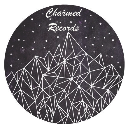
I originally thought that I need to make a complete
different one now as I'm not doing Indie Pop, but this wasn't the case. After
sitting down with my team mates we agreed that our original ones will do the
job for pop too. One of the main reasons for this was that Indie pop, is a
different kind of pop but still comes under the pop category. When I designed
my logo these are the things I discussed about my logo that I designed and
choose.
I
wanted the logo to be the shape of a record disc/CD, relating back to what
music us to be played off. To link back to my last development, I wanted
to keep to the geometric shapes with triangles. I kept my logo to black and
white to keep it simple to make the logo easy to remember. I choose for the
triangles to make a mountain to link back to you have to make your way up
the mountain to get to the top, showing the hard work. By having stars the
theme a satire night. Then to complete my logo I added text saying 'Charmed
Records'.
For these reasons I have kept with the same design.
This is displayed above. I am happy that I have re-done this post for pop as it
has made me make sure that this label is right for pop. If I didn't feel
the logo, name or both weren't right them I would have re-designed.
Comments
Post a Comment