My groups and I's target audience is mixed sex aged 13 to 26 years old. We did research into what are target audience likes and is interested. That way we can tailor our products to our target audience ensuring that they will like it. One of the initial bit of research I did was a mood board, this was very helpful to us me as I'm a very visual personal and liked that the images explained who we were aiming at. One of the main reasons this was most helpful to us as a group was working out what our image was going to be. We went for the edge average teen as this is what most people said they liked as they would relate to the video more, instead of a half necked teen.

We liked reserving constant feedback through out the making of our music video. This on below in particular was one of our favourite and most important feedback we relived from Mia. This was about our colouring.


Our main research was a question air which we distributed
across all of our social Medias to ensure we got a wide range of response. We
managed to get a 57 response to this questionnaire; this was very benedictional
to us. The reason for this was that we know that these results that we have
collected are going to be effective as the larger the number the better. One of
the results we carried out the strongest was making our music video a
narrative. 16 people said they liked just a narrative but 36 said both. For
this reason we made sure we had some element of performance. To do this each of
us did some lip syncing. The narrative wasn't very clear until later on when
editing. We originally didn't have the fad to black a white it was our target
audience who influenced us to change our ending to black and white fad. We also
found out that our target audience likes a range of shots, outfits and
locations because of this we included all these features into our music
video.
At first we were going to us Mr Potato Head by Melanie
Martinez after creating a storyline and pitching this to our target audience we
got very negative feedback. Saying the music video would not look professional.
As the artiest type of is very unique and already has a strong storyline. Because
of this response we decided to change everything, our storyline and song. We
pitched our new idea and our target audience preferred the new one much
more.
Before creating our digipak I conducted some research to
make sure I could make our digipak most effective. I looked at three different
designs which are for Rihanna and Katy Perry. Looking at professional design
really helped me see what composition a real digipak needs. Another part of
research/feedback we did was, we got together to discuss our individual designs
and explained our thought presses. This helped a lot as we were able to say
what we liked and disliked, we also fit into our target audience which was very
helpful.
When starting our magazine advertisement we did two lots of
research. The first lot of research I did was very similar to before where I
look at existing products that have been in magazines. Again this was very
helpful as able to see what the different types of layouts, they are and I was
able to see what were the most effective. We interviewed ten people in total
and asked them ten questions, which included examples of magazine advertisement
this was an important part as we were able to get there opinion. From this I
was able to start designing around the feedback I got from this. The last part
of feedback I got was we did a podcast to discuss what we liked and disliked about
each other’s. From this we came to the conclusion that, we didn't one design.
We came together and made a new one that took elements from our other
designs.
Feedback
Filming and Editing
We liked reserving constant feedback through out the making of our music video. This on below in particular was one of our favourite and most important feedback we relived from Mia. This was about our colouring.
This point had been brought to our attention by more than
one person, so we know we had to fix this ASAP because of the volume of people
who have told us this. This made the video not look very professional which is
not what we wanted. We looked on YouTube to see how this could be rectified.
The videos were very helpful as they allowed us to learn how to change the
colour overlays, exposure, brightness, shadows and more. Before our videos were
very raw and doll. We changed this to brighter and more vibrant as this is more
conventional for a pop music video.
One of the main people who we asked for feedback and
suggestions was our media teachers. This was really good to get an outsiders
thoughts and someone new to bounce ideas off. One of them infused the idea of
our ending. We watched the video together and realised that the ending was not
as powerful and clear as we wished it to be. Our teacher suggested we would
possibly change the colouring at the end to show changed. This is when we came
up with the black and white gradient, which was one of our most powerful parts.
Before taking this into action we asked other members of our class their
thoughts on this change. They are in are target audience range. The feedback
from this was very positive and very up-beat, which was brilliant. Because of
this we took this idea into action.
In the making of our
magazine we asked people in our class as well what they thought of our three
advertisements. The feedback was very repetitive, most of them said that our
posters do not connect back to our digipak theme and that they liked Paige's
layout. After this we came together and made a new one that was Paige's design
but we changed the background to an image of me sitting on the floor half black
and white and colour. We also changed some text to white where it was
needed.
We found feedback throughout was very helpful as we were
able to make our products the best they could be.
Feedback of Finished Products
As we found out that we would not publish out music video onto YouTube because of league reasons. We had to go round showering people individually our music video and as what they liked and disliked about our final products.
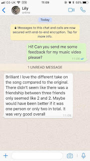
Music video


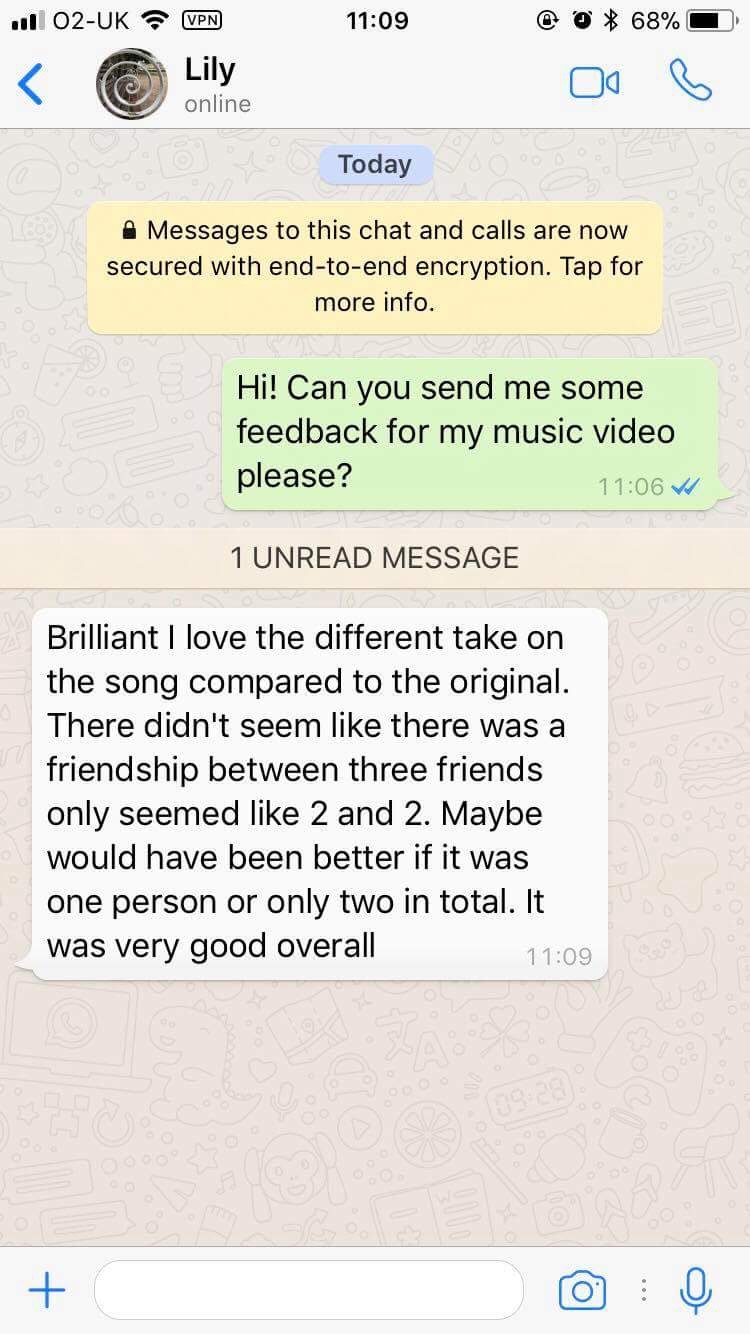
The feedback we resaved was mainly positive which we were
very happy about. We did also ask for a negative from our target audience. The
main points that where brought to our attention were we used wide shots; we had
three people lip syncing when there was only one voice that sang in the song
and duration of some of the shots. If we were to do this again we would
defiantly make sure to focus on these elements. The main feature that a lot of people
liked was our story line and how to ending was such a big impact.
Feedback - Digipak (Ancillary)
To get some feedback we texted some of our target audience directly on iMessage as this is a common way to talk to people in our target audience.


We were very pleased to hear that our digipak was up to
slandered and that our target audience liked it a lot. The negative comment
that we did resave was a point that we spoke about when disusing our digipak.
We did end up using shots from the music video instead of a photo shot which is
what most music artiest would do. When we was in the presses of making our
digipak we didn't get the chance to do a photo shot of our characters, because
of this we tried to make the best of a bad situation. This isn't the best part
of our music video but overall worked. When we were talking about the feedback
point we did agree we could have tried harder to find time. When designing we wanted
to challenge the conventions of a pop genre digipak. We were successful with
this as one of our messages said it was different compared to other pop music
digipak. James said 'really eye catching I would look at it if I saw it in a
shop' we were very happy to really this feedback as this is what we were aiming
for.
Feedback - Magazine Advertisement (Ancillary)
Again for our magazine advertisement we contacted people on iMessage.


Our feedback that we resaved from our target audience was
very positive. Above here there are some screenshots of messages that we
resaved from Amelia and summer. The negative comment that we did get we did
agree with too but we didn't know how to invert the colour. They said that the
black text was hard to read, they could make out what it said but if they were
flipping through a magazine they wouldn't stop to try and make out what it
says. We should have made the final advisement in Photoshop as there is a
bottom that you can press and it inverts the colour. We are glade that we were
successful in other areas the poster which we were pleased about.
The feedbacks that we have resaved over all the products
were very positive which we were happy about. We learnt that there options
matters a lot as they are who we want our buy our products and if they don't
like the product then they won't buy it. Looking back overall there are some
areas in which we could have put more time and effort into but we are still
happy with our feedbacks and out comes from this proses.
Comments
Post a Comment